
A tracking & software tech start-up elevated through strategic rebranding to gain trust in Germany’s change-resistant construction industry.
This project was carried out during my full-time position as a multidisciplinary creative at syniotec. I was tasked with leading and executing a wide spectrum of creative outputs.
A refreshed identity system that balanced boldness with trust modern enough to differentiate, yet grounded enough to remain authentic to the construction industry. From typography and color palette to imagery and iconography, every element was recalibrated to communicate clarity, simplicity, and reliability.
The new name encapsulates the brand’s mission: synchronizing people & machines with the possibilities of the future through tracking & IoT solutions & the highest technical standards.
Red was chosen as the brand’s foundation, used to draw attention where it mattered most. It symbolized energy, urgency, and forward momentum; standing out in a crowded industry without overwhelming. Applied strategically, it gave the brand a distinctive edge, ensuring visibility at key moments.
Black served as the brand’s foundation, reflecting reliability, authority, and premium quality. Used primarily across external communications and product design, it grounded the identity and reinforced the trust customers could place in syniotec’s solutions. In balance with white, it created a clean, minimal framework that highlighted clarity while carrying weight.
A branded Bluetooth tracker was introduced as a simple but powerful giveaway. Beyond being a goodie, it demonstrated syniotec’s technology in action, turning a pocket-sized object into a live proof point of the company’s mission to synchronize machines, data, and people.
A story built around the
industry, it's people and values
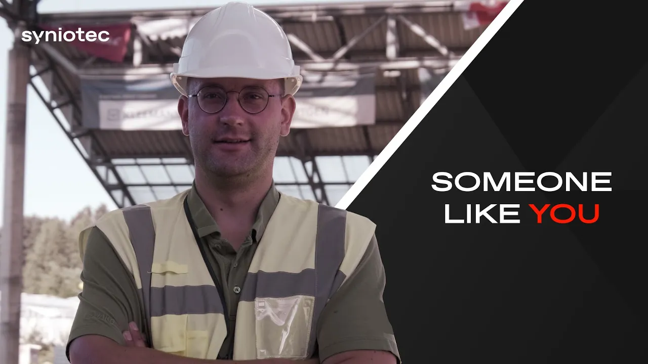
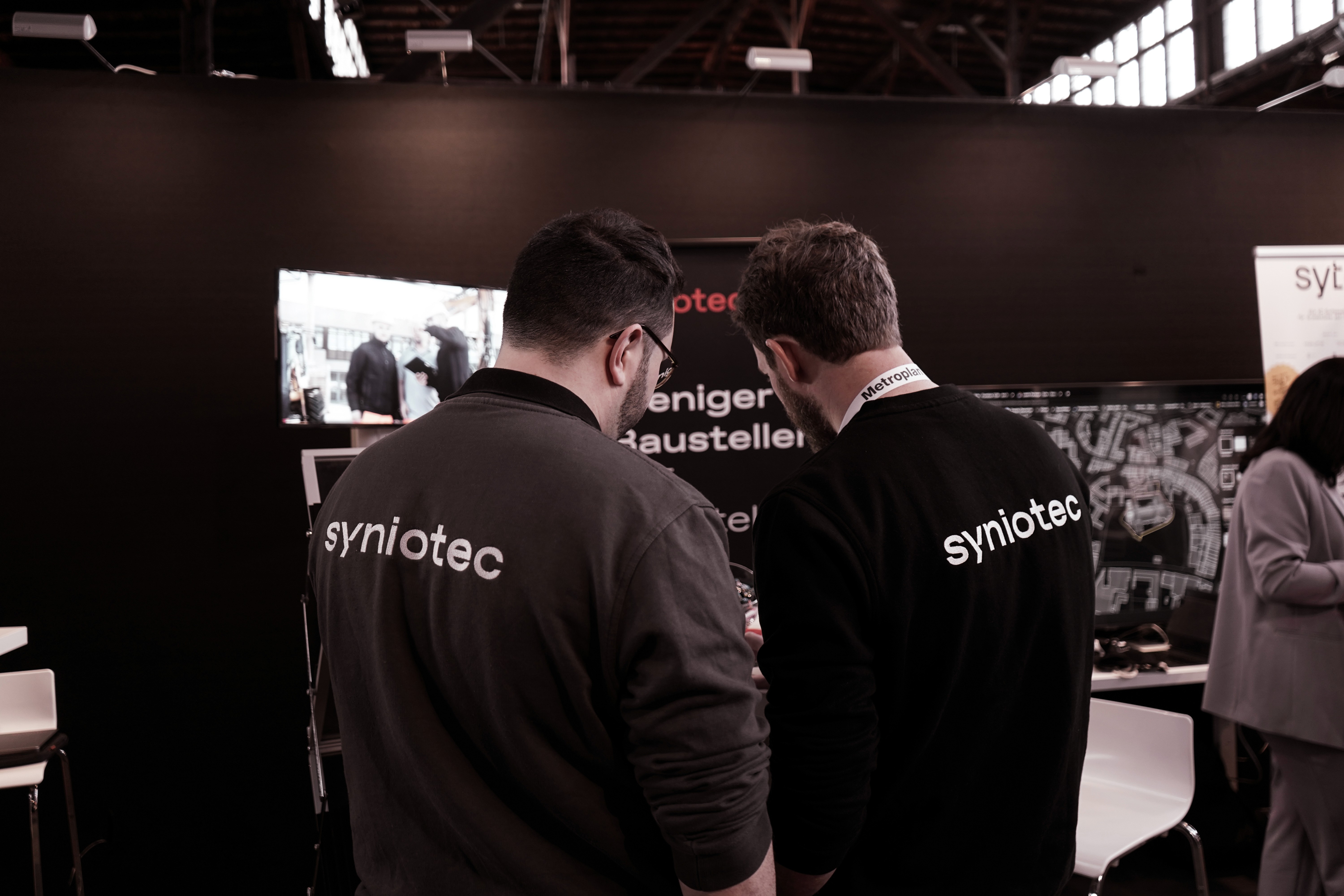
In an industry sensitive to change, the brand film was shaped to be about them, not us. It touched on the values of the construction industry; collaboration, precision, progress. In turn positioning syniotec as a partner working for and with the industry.

Complexity distilled
into simplicity that works
A comprehensive suite of solutions was restructured and simplified into clear, accessible communication. This shift ensured that syniotec’s offerings were not overwhelming, but approachable; matching the industry’s need for tools that are practical, straightforward, and ready to use.
As an example, the SAM (Smart Asset Manager for construction machines) was translated into a single clear narrative video distilling a complex, all-in-one system into a straightforward story, the video showed that advanced technology could still feel simple, usable, and essential to daily work.

A digital first impression
designed to be bold and clear
The website was built to serve as the brand’s digital front door: clear, confident, and unmistakably bold. It positioned syniotec as both approachable and forward-looking, ensuring the first point of contact with the brand reflected its ambition and trustworthiness.
Every message aligned,
speaking with one voice
Slides and pitch decks were reworked to reflect the new identity, ensuring alignment across every conversation. Whether presented internally or externally, these tools reinforced consistency, making sure the brand spoke with one clear voice at every level. Something especially important in an industry where trust is built on clarity and unity of message.

Offline Touchpoints Designed
to Make Trust Tangible
Slides and pitch decks were reworked to reflect the new identity, ensuring alignment across every conversation. Whether presented internally or externally, these tools reinforced consistency, making sure the brand spoke with one clear voice at every level. Something especially important in an industry where trust is built on clarity and unity of message.
The catalogue became a symbol of reliability, communicating clarity and confidence on behalf of syniotec long after the meetings ended. More than just a product list, it served as a physical ambassador of the brand: something customers could carry, revisit, and trust. Produced with attention to detail and durable finish,

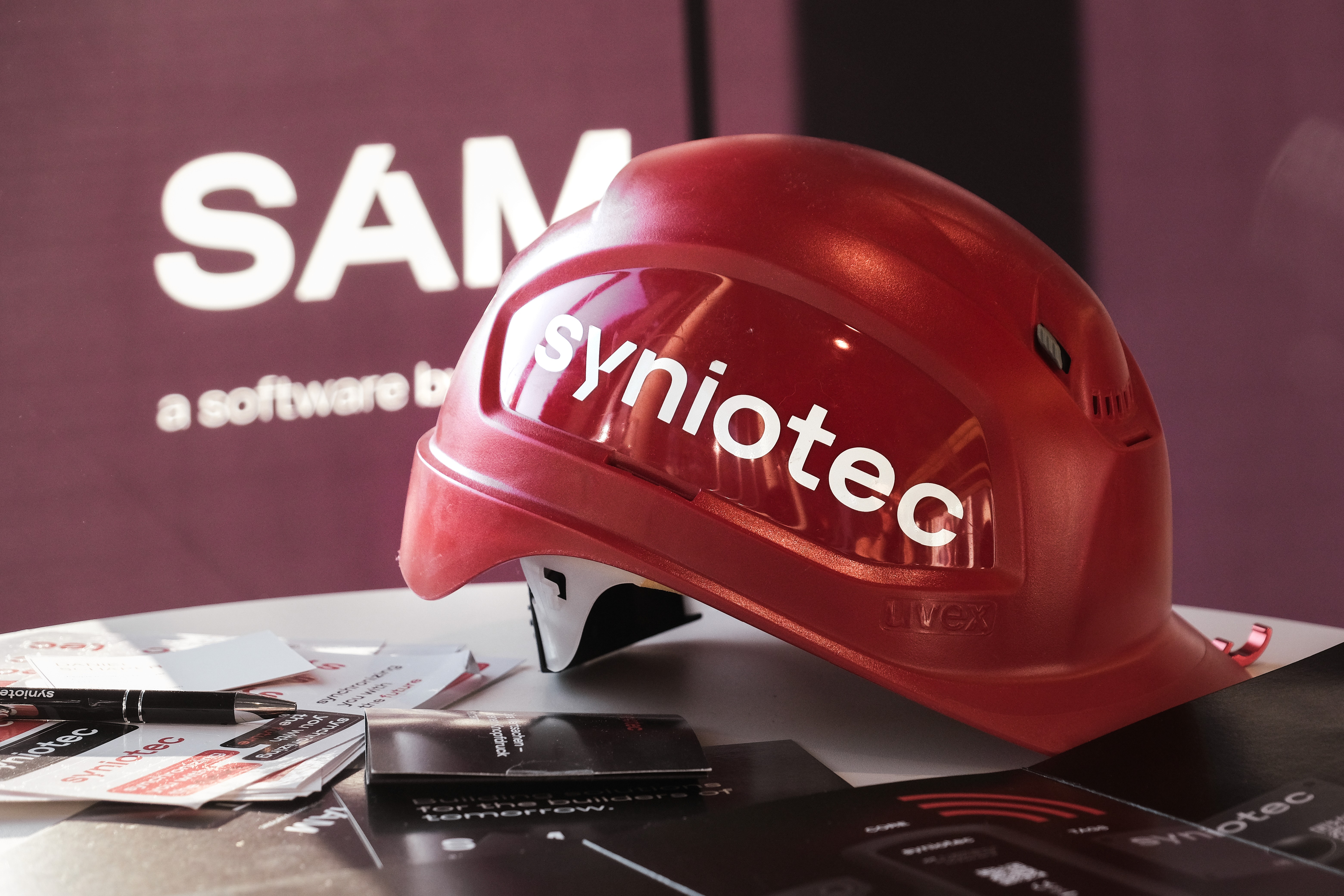
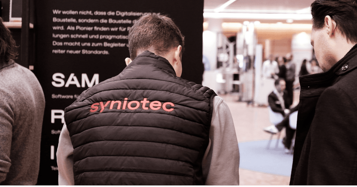
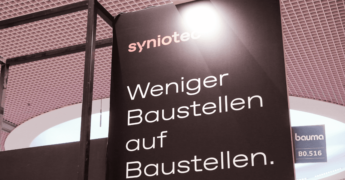
On social platforms, the bright red became the hook and black the anchor, creating a visual rhythm that caught attention and highlighted the products with contrast. This rhythm of bold contrast created a feed that was not only visually striking, but also immediately recognizable across the industry’s digital landscape